
Voice Prompting for Accessibility Improvements
A spoken method for turning an accessibility audit into specific, testable fixes
 Voiskey Team
Start From the Reading Order
Voice Prompting for Accessibility improvements should begin with structure, not color. Before you ask for a single style change, read the page from top to bottom in the order the markup presents it, ignoring the visual layout. If the reading order sends a screen reader through a sidebar before the main heading, the page has a structural problem that no color choice will fix. Write the order you want as a numbered list of headings and regions. Then speak one request that changes the markup order to match. Structure first means every later fix has a stable place to land.
Check the heading levels as a hierarchy rather than as a set of font sizes. A page should have one main heading, sections beneath it, and sub-sections beneath those, with no level skipped for visual reasons. Speak the hierarchy as an outline, for example: the main heading is Billing settings, then three section headings, then one sub-heading under the second section. Ask the editor to correct the levels without changing the visual size, and to keep the outline intact. When the levels are right, a user can navigate by heading alone, which is often the fastest way through a long page.
Use real regions and controls instead of styled containers. A clickable box that looks like a button but is a plain container cannot be reached or announced as a button. Speak the intended role in plain words: this control submits the search, so it should be a button; this group of links is navigation, so it should be a navigation region. Ask for the role and the visible label to agree. If a control needs a role that has no visible equivalent, question whether the design needs it at all. A spoken role request is short, and it removes a whole class of problems that styling cannot touch.
Write the structural findings into a short list with a location for each. A finding without a location becomes a general complaint; a finding with a location becomes a task. Use the form: on the account page, the main heading is missing; in the footer, the link group is a list of containers. Then order the list by how much it blocks: a missing main heading affects every visitor who navigates by structure, while a missing list role affects a smaller group. Structure work has a natural order, and writing it down keeps the next requests from drifting into decoration.
Describe Labels and Alternative Text Precisely
Every input needs a label that a person can hear and connect to the field. Speak the label text exactly, then say where it should appear and whether it must remain visible. Placeholder text is not a label, because it disappears as soon as typing starts. For a group of related inputs, say the group name and the individual labels together, for example: the address group contains street, city, and postal code. Then ask for the group to be announced as a group. Label work is mostly wording work, and wording is exactly what a spoken request handles well when you say the final text.
Write alternative text as a replacement for the image, not as a description of it. If the image conveys a fact, state the fact; if it is decorative, say that it should be ignored by assistive technology. A chart is the hard case: the alternative text should state the conclusion the chart supports rather than list every number. Speak the intended sentence, then say where it belongs. For a linked logo, the alternative text should name the destination rather than the picture. These three rules cover most of the images on a typical page, and they are easier to apply when you say them as a rule before the request.
Fix link text so it makes sense out of context. A row of links that all say read more is unusable when a user lists links without the surrounding paragraph. Speak the replacement text with the destination in it, for example: read the billing policy. If the visual design requires a short label, ask for additional text that is available to assistive technology while the visible label stays short. Then check that the two do not contradict each other. The spoken rule is simple: a link label should name where it goes, and the visible and announced versions should agree.
Name icon-only controls by their action. A button with a magnifying glass and no text needs an announced name such as search, and it should match the action rather than the picture. Speak the name and the state together, for example: a search button named search, and a filter toggle named filters that reports whether it is on or off. Then ask for the announcement to update when the state changes. Icon controls are where labels are most often missing, and they are also where a wrong label is most misleading, because the picture suggests one action and the code may perform another.
Ask for Keyboard Paths Explicitly
Describe the keyboard path as a sequence, not as a promise. Start at the top of the page, tab through each stop, and say what should happen at every one. Name the skip link and its destination, the order of the header controls, the main content, and the footer. Then say which controls should be reachable and which should be skipped, such as a hidden menu that only opens from its button. A spoken sequence is testable; a request to make the page keyboard friendly is not. The sequence also reveals a control that appears in the markup but has no visible focus style.
Handle overlays as a separate path. When a dialog opens, focus should move into it, stay inside it while it is open, close on escape, and return to the control that opened it. Speak those four rules in that order, because a dialog that traps focus but never returns it leaves a keyboard user at the top of the page. For a menu, say whether arrow keys move between items and whether escape closes the menu without selecting. Write the rules as part of the component description so they are built with the component rather than patched afterward. Overlay behavior is the most common keyboard failure, and it is also the most repair-friendly when spoken clearly.
Say how focus should look, not just that it should exist. A focus indicator needs to be visible against every background it can appear on, including a dark image and a light card. Speak the requirement as a rule: every interactive element keeps a visible outline that does not rely on color alone. Then name the elements that override the default, because custom styles are where the outline usually disappears. Ask for the indicator to be checked on the darkest and lightest surfaces on the page. A focus style that works on one background is a partial fix, and partial fixes are what make keyboard testing frustrating.
Add a keyboard check to the review, and write it as a short script anyone can run. Tab to the first control, follow the path, open and close each overlay, and confirm the focus return. Read the script aloud while you do it, because reading forces you to name each stop and exposes a step you have been skipping. When the check fails, the script tells you exactly which rule broke, which turns a vague accessibility bug into a sentence you can hand to the editor. Keep the script in the component folder so the check survives the person who wrote it.
Check Contrast and Focus in Context
Check text contrast against the surface it actually sits on, not against the design file background. A gray label that passes on white can fail on a tinted card, and a white heading can vanish over a photograph. Walk the page and list every text and surface pair, then check each pair with a contrast tool. Speak the failing pairs as concrete tasks: the muted helper text on the tinted card needs a darker tone. Do not change the whole palette to fix one pair; change the pair that fails and confirm the change does not break a neighboring pair. Contrast work is a series of small, verifiable swaps.
Treat non-text elements with the same care. Icons, borders, chart lines, and focus rings also need enough separation from their surroundings to be perceived. A chart that distinguishes series by two similar hues fails for a reader who cannot separate them, and a form field that marks an error only with a colored border fails for the same reason. Speak the requirement as a rule: state meaning with more than color, using a label, a pattern, or a shape. Then name one place on the page where meaning currently depends on color alone and ask for the second signal to be added there first.
Check the states under real conditions, including a bright screen and a dim room. Contrast that looks acceptable on a desk can disappear outdoors, and a hover style that works on a light theme can be invisible on a dark one. Speak one pass for each theme the product supports, and one pass for the disabled state, because dimmed controls are the pair most often overlooked. Ask for the disabled style to remain readable while still looking inactive; the answer is usually a different tone rather than lower opacity across the whole control. State checks are cheap, and they catch the failures that a single screenshot never shows.
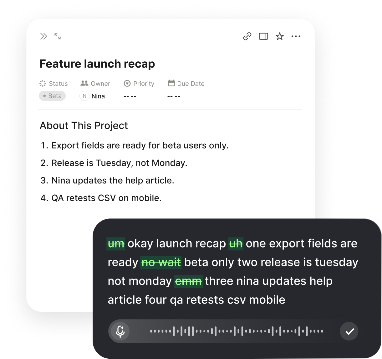
Use the spoken loop to record and fix each pair. Put the insertion point in the style file or the prompt field, hold the Voiskey shortcut, and say the change with both values and the reason, for example: change the helper text tone on the tinted card to the darker neutral. Voiskey removes filler words and false starts and adapts punctuation to the field, so the sentence is ready to review and keep beside the component. Then recheck the pair and the neighboring pair. Contrast fixes are easy to verify and easy to regress, so the note matters as much as the change.
Turn Findings Into Small Fixes
Collect the findings from the structure, labeling, keyboard, and contrast passes into one list, and rewrite each as a single change with a location. A finding such as the dialog is hard to use becomes after the dialog closes, focus returns to the button that opened it. The rewritten version names one element, one behavior, and one expected result, which is exactly what a spoken request needs. Then group the list by component rather than by category, so one pass through a file fixes several findings instead of making the same file open four times, and it makes each commit easier to describe.
Order the work by who is blocked and how badly. A page with no main heading blocks structural navigation for every visitor who uses it; a missing list role affects a narrower group; a contrast pair on a rarely used badge is smaller still. Write the order down and resist the urge to start with the easiest item. The first three fixes should be the ones that change whether a person can complete the task at all. When time runs short, that order is what you want to have followed, because it leaves the page usable rather than merely improved.
Fix in small commits with messages that name the element and the behavior. A message such as add visible focus to the filter toggle tells the next reviewer what to check. Keep the finding list beside the code and mark each item with the change that closed it. If a fix requires a design decision, write the question down and continue with the items that do not. Mixing open questions into code changes is how an accessibility pass stalls. Small, closed items build momentum, and momentum is what carries a pass to completion; a stalled pass is worse than a short one.
When you want the same workflow on your own machine, download Voiskey for Mac and Windows and keep the shortcut ready while the markup and style files are open. Voiskey turns a spoken finding into text at the insertion point, including file names and paths when you name them, which matches the way an accessibility list is written. It removes filler and self-corrections and adapts formatting to the field, so the fix sentence is clean enough to paste into a commit note or a review comment. The list, the code, and the note then describe the same change in the same words.
FAQ s
Voiskey is a voice typing app that works at the system level. You press a shortcut, speak the finding as one sentence, and the text appears at the insertion point in your markup or style file. It removes filler words and false starts, so the request reads like a written task.
Voiskey learns names, jargon, acronyms, and spelling preferences. If your review uses specific labels such as postal code or billing contact, saying them once in context helps the app reproduce them. Keeping a short list beside your notes keeps the wording consistent across requests.
Say the conclusion the chart supports rather than a list of numbers, then state where the text belongs. Voiskey clears self-corrections, so a revised sentence replaces an earlier attempt. Place the insertion point in the markup so the spoken text lands beside the image.
Yes. Voiskey types wherever the insertion point sits, including a markup file, a style file, or a prompt field, after you press the shortcut and speak. It also adapts punctuation and formatting to the field, which keeps a short finding readable as a review note.


 Voiskey
Your voice, amplified.
Download Voiskey for Mac and Windows and speak the next accessibility fix.
Use it across macOS, Windows, iOS, and Android