
Vibe Coding a Mobile-Friendly Layout by Voice
A voice-first routine for layouts that hold up from phone to tablet
 Voiskey Team
Set the Screen Targets Before You Talk
Vibe Coding a Mobile-Friendly layout starts with numbers, not adjectives. Before you dictate a single prompt, write down the screen widths your users actually hold: a small phone, a large phone, a tablet, and a narrow laptop window. Name each target in the prompt as a range, such as 320 to 380 pixels, 390 to 430 pixels, and 768 pixels and up. Decide what must stay visible at the smallest width: the primary action, the page title, and the item count. Keep this list beside your message window so every spoken instruction refers to the same targets, and reject any layout that only looks right at one size.
Ask the designer for the two or three widths that matter most and why. Ask the engineer which layout method the project already uses, since a spoken instruction should fit the existing approach rather than introducing a second one. If nobody owns the decision, default to the widths in your usage report for the last month and say so in the prompt. Write the targets in a short block that you can read aloud at the start of a session. Update the block only when real usage changes. A shared target list prevents the slow drift where each prompt refers to a slightly different phone.
Decide the reading order before the visual order. Speak the page as a sequence of regions: title, primary action, summary, list, filters, footer. This sequence becomes the order you describe every layout, so the mobile version inherits a sensible flow instead of a pile of guesses. If the visual design puts filters before the list on a wide screen, say clearly whether they move after the list on a narrow screen. Record the decision in one sentence and reuse it. Reading order is the part users feel most when the layout collapses, and it is cheapest to settle before any prompt.
Write acceptance checks the whole team can run. At the smallest target, the page must not scroll sideways, the primary action must be reachable without zooming, and no text may overlap a control. At the middle target, columns may sit side by side but must wrap before they become unreadably narrow. At the largest target, the layout may add a sidebar but must not stretch text lines beyond a comfortable measure. Put these checks in the task description, and treat any prompt that cannot state how it meets them as incomplete. Testers will use the same words, so disputes become concrete.
Describe Each Region in Reading Order
Write one prompt per region. Start with the page shell, then the header, then the main content, then any secondary panel. For each region, say its name, its content, and how it should behave when width shrinks. Use the same names every time so the editor associates the instruction with the same component. If a region repeats, such as a card in a list, describe the card once and say how many appear and how they wrap. One region per prompt keeps the change reviewable and makes a bad result easy to identify and undo. Keep the region list beside the prompt window.
Use a sentence pattern that names the condition and the result. For example, say that on screens narrower than 600 pixels the filter panel moves above the list and spans the full width. Speak the condition first, then the action, then the constraint. This order matches how you will test it later, because you can resize to the condition and look for the expected result. Avoid adjectives such as clean or modern; they cannot be verified. If a region needs two behaviors, split them into two prompts and check the first before speaking the second. Short patterns also make the spoken prompt easier to correct.
Handle the components that usually break. Tables need a stated fallback, such as horizontal scrolling inside a container or a stacked card view. Long labels need a rule for wrapping or truncation. Images need a rule for aspect ratio so they do not jump when the screen changes. Forms need a rule for label placement above fields on narrow screens. Speak each fallback as a separate prompt with the width condition included. Reviewers can then test the exact component that caused trouble last time instead of rechecking the easy parts of the page. Add one example value for each fallback.
Keep a spoken map of the page as it changes. When a prompt adds a region, say where it goes in reading order and update the map in the same note. When a region is removed, say what happens to its content and whether another region takes over. If two prompts conflict, the later one wins only after you say so explicitly and update the map. At the end of the session, read the map aloud and compare it with the rendered page. A map that matches the page is the handoff document for the next person. Date every update so the order of changes is clear.
Speak Responsive Rules One at a Time
Group the rules into four kinds: stacking, wrapping, hiding, and sizing. Stacking covers what moves above what. Wrapping covers when a row becomes a column. Hiding covers what disappears on a narrow screen, which needs a spoken alternative such as a menu or a summary. Sizing covers type, spacing, and media that scale with width. Speak one rule at a time and name its kind, so the editor does not blend a hiding rule into a sizing rule. When a rule spans two kinds, split it and test each half. This grouping also gives you a checklist for the review.
Never hide content without saying where it goes. If a secondary column disappears on a phone, state whether its content moves below the main content, into a collapsible section, or to a separate page. If it is truly omitted, say why and who approved it. A hidden control that leaves no path is a functional loss, not a visual simplification. Speak the replacement path in the same prompt as the hiding rule, and add a test case that follows the path at the narrowest width. This single habit prevents most mobile regressions. Add the replacement path to the acceptance list.
Constrain fluid text. State a minimum and maximum width for text columns, and a rule for what happens between them. On narrow screens, text should use the full width with side padding. On wide screens, it should stop growing before lines become hard to follow. Speak the padding and the maximum measure as numbers, not as a feeling. If headings and body text scale differently, say so. Reviewers should check a long heading and a long paragraph, since those two cases expose most of the problems with scaling rules. Numbers make the check repeatable across every page in the flow.
Write exceptions on purpose. A wide table, a code sample, or a large chart may need to scroll sideways even though the page must not. Name each exception, its container, and the reason, then put it in the acceptance list. Without a named exception, a reviewer will flag the table as a bug, or worse, an engineer will squash the table to satisfy a rule meant for text. Speak the exception before the general rule so it is not forgotten. Revisit exceptions each quarter and remove the ones the design no longer needs. Fewer exceptions means a simpler review and a shorter test round.
Test Layouts on Real Screens
Test in the order users meet the page. Start at the smallest target, because that is where collapse problems appear. Check the first screen, then the primary action, then the list. Resize slowly through the breakpoints and watch for a moment when two rules fight, such as a column wrapping while its parent still holds a fixed width. Note the exact width where the problem appears. Repeat at the middle and largest targets. A test that only checks the final screenshot misses the transition, which is where most mobile defects live. Write each finding with the width and the region.
Check the states, not just the happy path. Open a menu, focus a field, show an error, and load a long list. On a phone, check that the on-screen keyboard does not cover the field being edited, and that the primary action remains reachable. Check that a sticky header does not eat half the screen. Check that images keep their space while loading, so the page does not jump. Speak these checks as a list before the session and tick them off, because state testing is the first thing a rushed review skips. Repeat the list on every page that shares the shell.
Log findings where the fix will happen. With Voiskey, you can speak the finding into the issue tracker field while the failing screen is still open, and the text appears at the insertion point without copying from notes. Say the width, the region, the expected behavior, and the observed behavior in one short report. Download Voiskey and use it for a single test round to see whether spoken reports save time. The point is to capture the exact width while you still remember it, since a vague width is not reproducible. Attach a screenshot name when your tracker supports it.
Fix in a deliberate order. Blocking problems first: sideways scroll on the page, an unreachable primary action, overlapping text. Then content loss: hidden controls with no path, truncated labels that change meaning. Then polish: spacing, alignment, type size. After each fix, rerun the exact case that failed and one nearby case that passed. If the fix changes a shared component, rerun the pages that use it. Close the round when every blocking and content issue has a recorded result, and leave polish items in a dated list. This order protects users before it protects appearance. Record who verified each blocking fix.
Keep a Spoken Review Loop for Layouts
Schedule a short layout review every week. Open the pages that changed, resize through the targets, and speak your decision into the review note as you go. A spoken note such as cards wrapping at 520 but clipping at 360 is more useful than a vague approval. Voiskey removes filler and false starts from that note and places it at the insertion point in the review document. Keep the note next to the screenshot name so the discussion has a reference. Twenty minutes a week catches drift before it reaches a release. Rotate the reviewer so the whole team learns the targets.
Maintain a shared vocabulary for the layout. Agree on names for the shell, header, list, card, filter panel, and footer, and use those names in prompts and reviews. Voiskey learns names, jargon, acronyms, and spelling preferences, and a team plan adds shared vocabulary and workflows, so a new teammate can speak the same names on day one. When a component is renamed, update the list in the same change as the code. Consistent names make searches, prompts, and review notes point at the same thing. That consistency is worth more than any single clever prompt. Add new terms to the list the day they appear.
Download Voiskey on the machines used for review, not only on the build machine. Reviewers often work on a laptop while looking at a test build, and speaking the finding into the note where they see it removes a copy step. Press the shortcut, say the width and the region, then edit the sentence at the insertion point. The workflow is Speak-Polish-Type-Edit, and it suits layout review because findings are short and frequent. Pair the habit with the written acceptance list so spoken notes always map to a check. Download once, then make the shortcut part of the review routine.
Close the loop with a handoff note. At the end of each review, write three lines: what changed, what still fails, and which target is next. Attach the note to the task and tag the owner of each open item. When a page is retired, remove its entries from the review list so the loop stays short. Once a month, read the notes together and look for a repeated width or region that keeps failing; that pattern usually points to a shared component rather than a single page. Fix the component and the list gets shorter. A short list is a sign the loop is working. Keep the note with the review record.
FAQ s
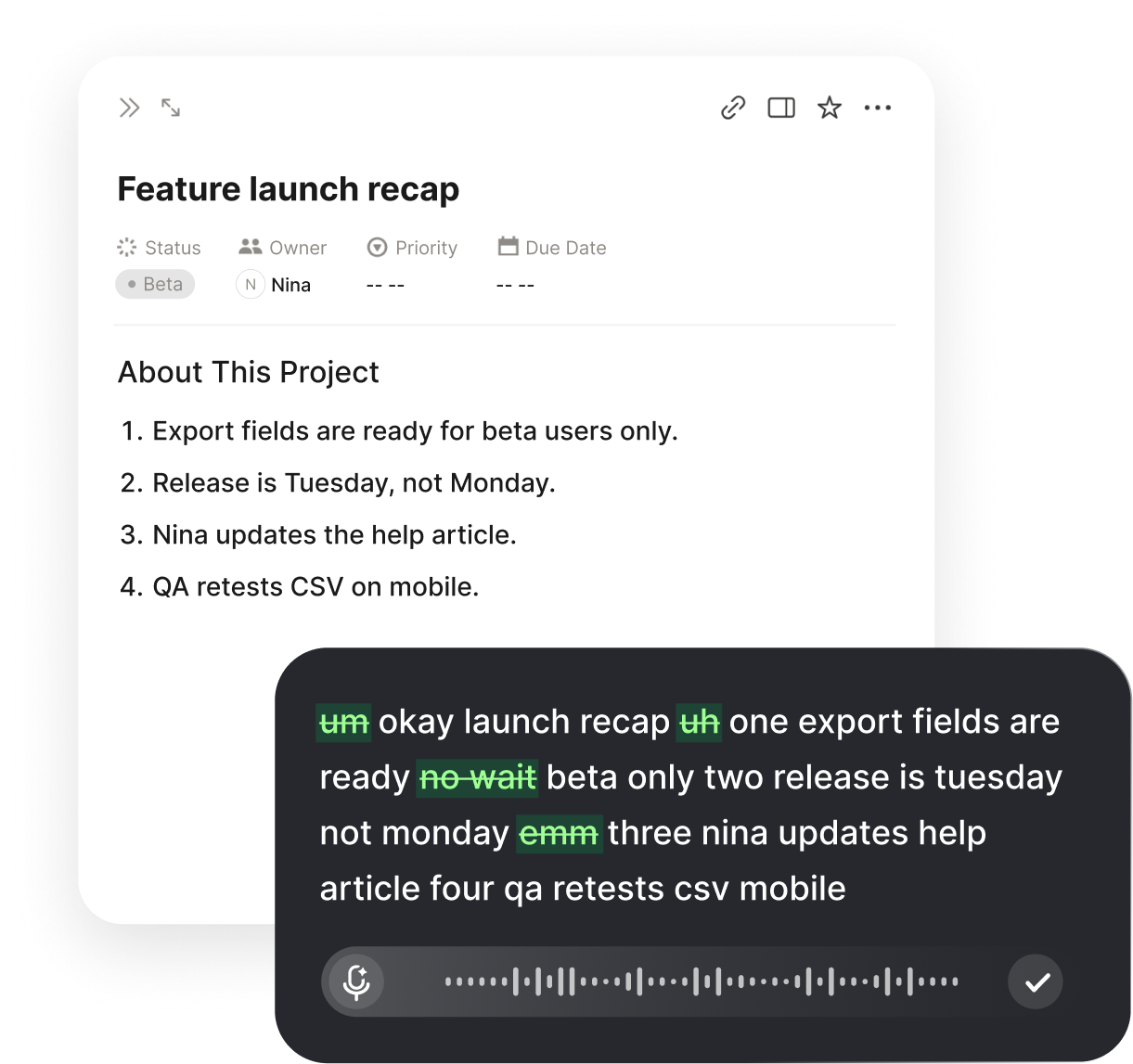
Voiskey is an AI voice typing app for desktop use. You press a shortcut, speak the layout instruction, and text appears at the insertion point in your code editor. It removes filler words, stutters, and false starts, and adapts punctuation and wording to the task, so a spoken rule about wrapping or stacking arrives as a usable prompt.
Yes. Voiskey supports up to 220+ words per minute, about five times faster than typing, so a spoken finding takes seconds instead of a paragraph of typing. Say the width, the region, the expected result, and what you saw, then edit the sentence at the insertion point. Faster notes mean you record the exact width while the failing screen is still in front of you.
Use one name per component in every prompt and review note. Voiskey learns names, jargon, acronyms, and spelling preferences, so repeated use of a term such as filter panel or page shell keeps the spelling stable. A team plan adds shared vocabulary and workflows, which helps a new teammate speak the same names.
Voiskey works at the system level. Press a shortcut, speak, and text appears at the insertion point in any app or text field, including your code editor. You can speak a file name, a path, or a command as part of the request. Review the generated prompt at the insertion point before running it.


 Voiskey
Your voice, amplified.
Download Voiskey for Mac and Windows and speak each layout rule at your insertion point.
Use it across macOS, Windows, iOS, and Android