
Vibe Coding for Designers Who Do Not Write Code
A practical path for designers to describe screens, request behavior, and review results
 Voiskey Team
Start From Screens, Not Syntax
Vibe Coding for Designers is less about learning syntax and more about describing interfaces with enough precision that a coding agent can build them. You already know how to judge a screen: spacing, hierarchy, state, and the way a layout behaves when content changes. Those judgments are the hard part of design work, and they translate directly into instructions. The part you need to add is a habit of naming things consistently and checking results against a written intent. Start with a screen you understand well, and let the agent handle the code while you concentrate on the outcome. A screen you know well makes a calm first build.
Begin every session by looking at the screen rather than the codebase. Take a screenshot or open the design, and describe what you see in three layers: the structure, the states, and the edge cases. Structure is what sits where. States are what the screen looks like when it is empty, loading, full, or broken. Edge cases are the long names, missing fields, and tiny viewports. Writing those three layers takes five minutes and gives you a prompt outline that does not depend on knowing any framework. Three layers are enough to start, and they expose gaps in the brief early.
Learn the names the engineering team uses for shared pieces, even if you never write the code. A card, a panel, a token, and a breakpoint are words that carry specific meaning in a codebase, and using them keeps your requests aligned with the existing structure. Ask for a short glossary during your first week and keep it beside your design notes. When you do not know a name, describe the purpose instead of inventing a synonym. Consistency matters more than vocabulary size, because a stable set of terms is what makes spoken instructions reliable across sessions. A shared name is a shortcut both roles understand.
Accept that you will not understand every line the agent produces, and build a different kind of confidence. Instead of reading code, verify behavior: does the screen match the design, do the states behave, and does the layout hold when content changes. Keep a short checklist for each screen and run it every time. When something fails, describe the visible difference rather than the suspected cause. This approach uses your strongest skill, visual judgment, and turns it into a reliable review method that does not require a computer science background. Behavior is the part you are qualified to judge, so judge it closely.
Translate Visual Intent Into Words
Translate visual intent into words by working from the largest decision to the smallest. Start with layout, then spacing, then type, then color, then motion. At each level, say what should stay fixed and what may adapt. A useful sentence is the sidebar keeps a fixed width while the main column grows. Another is the card grid collapses to one column below the small breakpoint. These are decisions you already make in a design tool, and saying them aloud is the only new skill involved. The order prevents a prompt from drowning in detail before the structure is settled. Structure settles before detail, and detail settles before polish.
Use comparison to make a visual instruction concrete. Say make this row match the header row, or set this spacing to the same value as the section gap. Comparison is precise without requiring numbers, and it ties the change to something the agent can already see. When you must use a number, give the unit and the reference, such as sixteen pixels, matching the card padding. Avoid subjective words alone, like tighter or nicer, because they leave the decision to the agent. Pair every subjective word with a comparison or a number. A reference the agent can see beats an adjective it has to interpret.
Describe states as small scenes rather than as attributes. Instead of saying the button is disabled, say when the form is empty the button is dimmed and does not respond. The scene gives the agent the condition and the visible result in one sentence. Do the same for hover, focus, loading, and error. Designers often hold these states in their heads, but a coding agent needs them written down. A short list of state scenes per component is the most valuable artifact you can hand over, and it is faster to speak than to draw. Scenes are easier to test than attributes and harder to misinterpret.
Keep a personal phrasebook of instructions that worked. When a sentence produces the result you wanted, save it next to a screenshot of the outcome. Over time the phrasebook becomes a design vocabulary that is both precise and reusable. Share it with other designers on the team so they do not start from scratch. The phrasebook also helps when you hand a screen to engineering, because the same sentences describe the intended behavior in the ticket. A shared phrasebook reduces the translation loss between design intent and built interface. The phrasebook is the most portable part of the whole method.
Ask for Behavior in Plain Language
Ask for behavior in plain language and let the agent choose the implementation. A sentence like when the user picks a filter the list updates without a full page reload describes behavior completely, and it leaves the method open. This is the right level of abstraction for a designer, because it commits to the experience without committing to a technique. If the result behaves correctly but the approach worries you, ask a follow-up question about the approach rather than trying to specify it yourself. Behavior first, technique second, is the order that keeps you in control. The experience is the contract, and the technique is negotiable.
Describe interactions as a sequence of cause and effect. Say clicking the row opens the detail panel, pressing escape closes it, and the list keeps its scroll position. Three short clauses describe an interaction that would take a page of prose to specify any other way. Use the words a user would use, not the words an engineer would use, unless you are naming an existing component. When a sequence has branches, say the common path first and the exceptions after. Clear order makes the request easy to build and easy to test. A sequence is easier to discuss than a paragraph of requirements.
Be explicit about what should not change. Designers often focus on the new behavior and forget the surrounding screen, and that is where regressions appear. Add one sentence: do not change the header, the spacing, or the other rows. This constraint is cheap to say and prevents the agent from tidying things you wanted left alone. If a change must propagate, say where it stops. Naming the boundary is a design decision, and it belongs to you rather than to the agent. Constraints are as much a part of the brief as the requested behavior. A stated boundary is what keeps a small change small.
Ask for a small, reviewable change and resist the urge to bundle. A single interaction, a single state, or a single layout adjustment per request keeps the result easy to inspect and easy to undo. Bundling several changes into one request makes it hard to tell which sentence produced which result. When a screen needs many changes, order them by visibility: structure first, then states, then polish. Review after each step. Small steps feel slower at the start and finish faster, because you spend less time untangling a result that went in an unexpected direction. Bundles hide cause and effect, and review depends on that link.
Review Output Without Reading Every Line
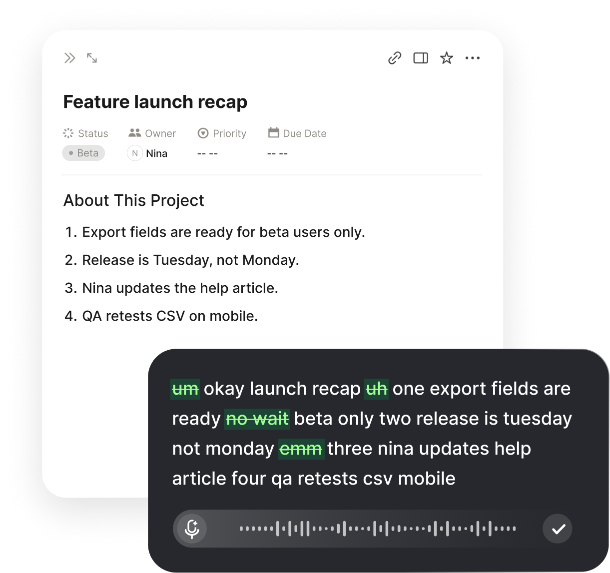
Review output by behavior, not by line count. Open the built screen next to the design and compare them at the same size. Check the structure, the spacing rhythm, the states, and the edge cases from your checklist. When something differs, describe the visible difference in one sentence and let the agent fix it. If you use Voiskey, you can speak that sentence directly into the message field, and the app removes filler so the report is precise. This review method uses visual judgment and avoids the trap of pretending to read code you do not know. Visual comparison is the review method you already trust.
Keep a short review checklist for every screen and reuse it. The list might include alignment, spacing consistency, empty state, loading state, error state, long text, and small viewport. Run the whole list even when the change looks trivial, because trivial changes are exactly where a broken state hides. Mark each item pass or fail in the ticket, and attach a screenshot of any failure. A checklist turns a vague sense that something is off into a specific, fixable report, and it makes your reviews consistent from one screen to the next. A reusable list also makes two reviewers agree on what passed.
Learn to spot the few code signals that matter to design work. You do not need to read logic, but you can look for hard-coded sizes, colors that bypass the shared tokens, and layout values that do not match the spacing scale. When you see one, say what you noticed and ask whether it should use the shared value. This is a question, not a diagnosis, which keeps the conversation productive. When you download the latest Voiskey build, you can dictate those short questions in the same field where you write the review, without switching tools. A question keeps the review collaborative and still gets the fix.
Close the review with a walkthrough that mimics a real user. Click through the main path, then the empty path, then the error path, and watch for anything that feels different from the design. Write down the three most noticeable differences rather than every tiny one. Prioritize by what a user would hit first. Send the list as a short spoken message if that is faster, and keep it in the ticket. A review that ends with a prioritized list is far more useful than a long note that treats every pixel as equally important. Priority turns a review into a plan rather than a pile.
Build a Designer-Friendly Routine
Build a routine that starts with design artifacts and ends with a checked screen. Open the design, write the three layers, speak the structural instructions, and review by behavior. Keep the same order every time so the routine survives busy weeks. Add one habit at a time: first the three-layer note, then the state scenes, then the checklist. A designer-friendly routine does not ask you to become an engineer; it asks you to express design decisions in a form that a coding agent can act on. That is a skill you can build in a few afternoons. A routine built in small steps is a routine that survives.
Set aside a weekly slot for reviewing what the agent built and what you asked for. Compare the phrases that worked with the screens they produced, and update your phrasebook. Notice the requests that consistently came back wrong, and rewrite them with a comparison or a number. This review is design work, not engineering work, and it improves both the built interface and your ability to describe the next one. Fifteen minutes a week is enough to keep the vocabulary sharp and the routine honest. The phrasebook is a living document, and the weekly slot keeps it current and useful.
Bring engineering into the loop at the handoff, not at the beginning. Share the phrasebook, the state scenes, and the checklist so the team speaks the same language about the screen. Ask for a short review of the built result against the same checklist, and treat disagreements as useful information rather than as failures. When designers and engineers review with the same words, the gap between intent and implementation shrinks without anyone needing to read code they do not own. The routine becomes a shared practice instead of a personal shortcut. A shared routine is what turns a personal shortcut into a team habit.
Measure progress by the number of review cycles a screen needs. A screen that once took five rounds of feedback and now takes two is a screen where your instructions improved. Track this informally for a month and look for the pattern. If the cycles are shrinking, keep the routine. If they are not, the problem is usually a missing state scene or a vague structural sentence. Fix that one part rather than overhauling everything. Steady, small improvements in how you describe screens are what make vibe coding practical for designers over the long run. The trend matters more than any single screen, so watch it monthly.
FAQ s
Voiskey is an AI voice typing app that works at the system level. Press a shortcut, describe the screen you want, and the text appears at the insertion point in your editor. It removes filler words, stutters, false starts, and self-corrections, then adapts punctuation, formatting, tone, and phrasing to the task, so a spoken design brief reads like a precise instruction.
Describe three layers: the structure, the states, and the boundary cases. Structure is what sits where, states cover empty, loading, full, and error, and unusual cases include long names and small viewports. Add what should not change, such as the header or the spacing. Spoken as short sentences, these layers give a coding agent a complete brief without any syntax.
Yes. Open the built screen beside the design and speak one sentence that names the visible difference, such as the gap under the header is larger than the section gap. Voiskey places that sentence at the insertion point and removes filler words, stutters, false starts, and self-corrections, so the report stays short and specific. A precise sentence is easier to fix than a vague complaint.
Press the shortcut, speak, and the text appears at the insertion point in whatever app or text field is focused, including the drafting app where you describe a screen. Voiskey adapts punctuation, formatting, tone, and phrasing to what you are trying to do, and it learns names, jargon, acronyms, and spelling preferences. It supports 100+ languages and translation.


 Voiskey
Your voice, amplified.
Download Voiskey for Mac and Windows and describe your next screen out loud.
Use it across macOS, Windows, iOS, and Android