
A Figma to component workflow: scaffold the skeleton before the first custom style
A Figma to component workflow starts with describing the layer tree aloud. Read the layer tree as a component map, then describe layout and state changes. Diff the skeleton against the mockup and keep it honest when the design shifts..
 Voiskey Team
The Mockup Waiting to Become a Component by Monday
The mockup lands on Friday, the ticket says build the settings card, and Monday morning there is an hour of sprint planning where the card is already overdue. The slow part is never the coding; it is the naming and the spacing decisions the designer never wrote down: what is the gap between the label and the input, what happens to the save button when the form is invalid, and what should this component be called in the codebase. In a Figma to component workflow, these silent decisions are the real work, and the reason they stall is that they are visual questions that get answered by eye while the developer is typing, rather than by agreement while the developer is thinking.
The mockup holds the answers, but only to someone who reads it as a specification rather than as a picture. Every element in the frame is either content, a component, a state, or a decoration, and the layer tree in the design tool already distinguishes them: a frame, a slot, a state variant, a vector. Reading the layer tree as the component map, before any code, converts the picture into a list, and a list can be described, agreed, and handed to an agent. The night-before problem is really a morning-of problem, since the mockup-to-component work always compresses into the day it is due, and the compression is what produces the off-by-one gap and the mystery color that no one can defend.
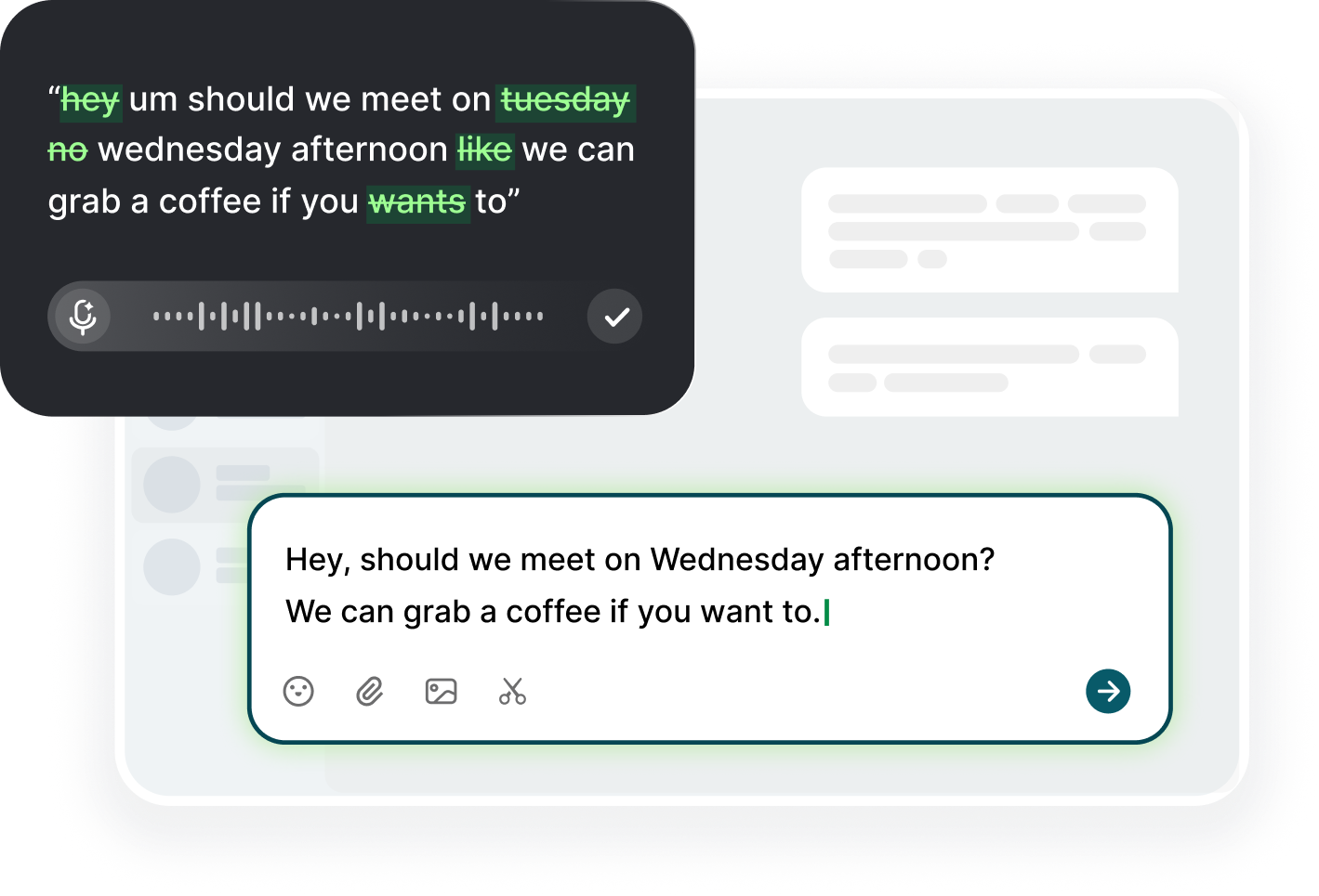
The best time to speak the mockup is within the first hour of receiving it, while the designer's intent is still fresh and while the questions are cheap to ask. Dictate the frame aloud as you scroll it: the settings card has a title, a list of three rows, each row with a label, an input, and a validation line, and the rows are separated by a divider. Two minutes of narration, and the component's shape is already known. The narration is also the artifact that survives: the spoken reading of the mockup becomes the acceptance criteria for the skeleton, and the next developer to touch the card has a description of the intent instead of a reverse-engineering job.
The deadliest trap is starting to code directly from the visual, since a visual-first build produces the card that looks right at one zoom level and desynchronizes at every other. The discipline of the spoken description forces the geometry into language first, and language cannot hold a guess: if you cannot say where the divider sits, you have not looked at the layer tree. So the ritual is: look at the mockup, speak the structure, read the layer tree, speak it again with the frame names, and then open the editor. The component that survives a redesign is the one whose builder could describe it in sentences, not the one whose builder copied it in pixels.
Reading the Layer Tree as a Component Map Before Coding
Open the design file, expand the layer tree, and read it top to bottom as a list of the components you will build, and this is where the mockup starts to smell like code. The tree reads: settings-card, card-header, card-body, row, row-label, row-input, validation-message. Each line is either an element you will render or a wrapper you will drop, and the names in the tree are the names the designer settled on, so they are the best available candidates for your component names. Say the top three levels out loud before touching the editor: settings card, row, and validation message, and let the assistant turn them into the folder structure you propose.
The tree also exposes the layers that are decoration rather than structure, the drop shadow frames, the absolute position groups, the overlay cursors. Reading the tree aloud separates them naturally because they sound like decoration: this frame has a shadow, this group is the hover overlay, this one is the cursor icon. Decoration gets its own small style or a token, not its own component, and a component boundary drawn around decoration is the classic mistake the layer tree prevents. When you narrate the tree to the agent, tell it which layers are decoration and which are structure, since the agent that guesses the boundary guesses a prop that dies in the first review.
Pay attention to the variants in the tree, since variants are the state map: the frame for the empty state, the frame for the error state, the frame for the loading state, all sitting alongside the default. The state map is the most valuable thing you can extract from the layer tree, because states are where the handwritten components fall apart, and the state list becomes the skeleton's contract. Say the states in the order the user meets them: default, focused, invalid, submitted, and let the assistant scaffold the skeleton with those four states as props or slots. A skeleton built from the state list is already halfway to production, while a skeleton built from the default frame has to be retrofitted with states the day the ticket mentions them.
Visit the design tokens page of the file or the team's theme while you are still in the tree, and say the tokens you will need: the error color, the success color, the spacing unit. The token names are the vocabulary that binds the component to the theme, and a component that hardcodes the error color is a component that will be found by a different name in every file it was copy-pasted from. Dictate the token mapping in one sentence: the validation message uses the error color and the body font size, and then let the assistant check that those tokens exist and fail loudly if they do not. The reading pass finishes with a map: structure, states, tokens, all spoken, all agreed, and the editor finally opens.
Describing Layout, Spacing, and State Changes Out Loud
Now describe the layout precisely, because the gap between the label and the input is not a preference, it is a decision, and the mockup encodes it in pixels that mean nothing to an agent. Say the spacing in the terms the design system uses: the rows are separated by the medium spacing token, the label sits a small token above the input, and the card padding is the large token. The spoken version converts the pixel look into the token language, which is the language the code will actually speak, and the translation is the job that visual inspection always skips. If the design system has no token for the gap, this is the moment to say so and to pick a token, rather than to hardcode a number that the next designer will hunt for three months.
Describe the behavior of the layout rather than its static appearance: the input grows with its content, the row remains one line until the error appears and then wraps, and the card stops at the maximum width. Behavior descriptions are the ones that turn the skeleton into a component, because an agent scaffolding from behavior knows which props the element needs and which ones it can ignore. Describe the interactions the same way, in the order the user triggers them: focusing the field shows the label, filling it clears the validation message, and blurring it with a bad value shows the error line. A narrator who reads the flow aloud in user order is the only reliable person to notice the missing step, such as the empty state that the mockup never shows and the ticket never mentions.
Spacing out loud has an underestimated side effect: it makes the trade-offs discussable. When you say the gap is the medium token but the mockup shows a larger gap, the designer either agrees, which settles the token, or corrects you, which saves you from building a gap the team will argue about in review. The correction is cheaper in the describing hour than in the code review, and the describing hour is where a Figma to component workflow actually earns its keep. The spoken pass is the meeting that the Friday mockup skipped, and its absence is precisely why Mondays become negotiation sessions about the number eight.
State the state changes in conditional English, since a state is a rule, not a frame: when the form is invalid, the input border turns the error color and the validation message appears below the row. The conditional sentence is the spec the agent can implement directly, and the default frame in the mockup is just the happy case. Read the sentences back once you have them, and check whether the rules cover the obvious cases: the disabled state, the submitted state, the long-text state. The component that behaves correctly in all of them is the one whose builder described them out loud before writing a single style, and the skeleton that follows is a faithful rendering of a spoken specification rather than a transcription of a picture.
Diffing the Built Skeleton Against the Mockup Screenshot
The first render of the skeleton is never the mockup, and the diff should be taken as a checklist rather than an embarrassment. Take a screenshot of the built component, open it beside the mockup, and narrate the differences in the order the eye finds them: the spacing above the title is larger, the input is full width whereas the mockup shows it narrower, and the validation message has a gap that reads as a margin. The narration is the diff, since the eye scans while the voice forces precision, and the precise list is what you feed back to the agent, one sentence per difference, with the token name or the rule that should win each one.
Not every difference belongs in the component: some belong in the design system. The mockup's error color that does not match the theme's error color is a seven-minute decision between the designer and the theme, and the component is the wrong place to fight it. Say the classification aloud as you find it: this is a component gap, this is a token question, this is an interpretation choice, since the prototype and the theme are two layers and the component should reflect the theme rather than override it. The diff that is sorted into three buckets takes ten minutes to fix, while the diff that is treated as one blob starts another Monday argument about the same gap.
The screenshot diff has its own honesty problem: a static render cannot show the states. Open the component in its interactive story, run it through the states you described, and narrate each one as it appears: the focus state works, the invalid state shows the message, and the border color is the theme's error color, and the submitted state is still showing the old value. The state walk is where the skeleton succeeds or fails, since the mockup showed only the default and the code must survive all the others. The state mismatch is normal on the first pass, and the fix is usually a prop or a class rather than a rewrite.
Use the mockup screenshot as the acceptance document even after the fixes: keep it in the pull request, and write the one-line description of what the skeleton does, so the reviewer knows the standard the component was measured by. When the diff is clean, or the differences are deliberately recorded as follow-ups, the skeleton has done its job: it has made the structure, the states, and the tokens explicit before the styling effort began. The styling is now a task with a target, which is the whole benefit of the skeleton approach, and the target is a screenshot the designer can actually approve, rather than an impression the designer has to describe in a review meeting that has no mockup in it.
Keeping the Skeleton Honest When the Design Sneaks Changes
The design never stops moving, and the skeleton's job is to make the movement visible rather than silent. The sneaky change has a recognizable shape: the toggle with the new default, the row that gains a trailing element in the new mockup, the spacing that shifts from medium to large between two design reviews. When you see the new frame, say the change aloud, name what it breaks in the skeleton, and decide whether the skeleton absorbs it as a new prop, a variant, or a small restructure. The decision is cheap while the skeleton is young and expensive after the styles are tuned, so the honesty ritual is: say the change, name its cost, and schedule it the same day.
The tiptoe pattern is the worst: the designer updates the mockup, nobody mentions it, and the component drifts from the design until a screenshot lands in a review and the team wonders who owns which truth. The skeleton fights this pattern by anchoring the spoken description, since the component has a documented structure and states, so any new mockup can be diffed against the description rather than against nothing. When the new frame contradicts the description, the contradiction is a decision, and decisions are made in conversation, not in silence. Keep the description in the pull request and refresh it as the contract, and the next designer sees the shape they promised to the last one.
Every sneaky change is either a bug the design is hiding or a feature the design has become, and the classification is spoken in one sentence: this is a new state, so it becomes a variant, or this is a visual tweak, so it becomes a style token change. The classification decides who owns the work, since a state change touches the component's contract and a visual tweak touches the theme, and the two have different review paths. Classification also keeps the skeleton from being quietly styled into a different component, since a skeleton that absorbs five visual tweaks is a component nobody can name, and the naming problem is the one the layer-tree reading pass was created to prevent.
The final guard is the pairing: the mockup's file link and the component's story live in the same ticket, with a one-line spoken summary of what changed this week. The pairing is the team's memory, and when the next designer makes the next subtle change, they read the line and know which decisions survive. Honest skeletons survive the design process, which is inherently a moving target, because honesty means the movement is always visible in the diff and never buried in the styles. The component that the team trusts is not the one that matched the mockup on Monday, it is the one whose description still matches the mockup on Friday, and that is a description the developer has to keep speaking, out loud, every time a frame changes.
FAQ s
Read the layer tree as the component map before writing code: expand the design file, say the top three levels of names out loud, and separate structure from decoration. Then describe the states in the order the user meets them and the spacing in theme tokens. The spoken map becomes the spec the agent scaffolds from.
Decide in the describing hour rather than in the code: say the gap or color you need in plain words, pick the closest existing token, or ask the designer to add the token. A component that hardcodes a value is a component with a future search mission, so surface the missing token to the team instead of absorbing it quietly.
Close on structure and states, loose on styling. The skeleton must show the same layout, the same state transitions, and the same token vocabulary; the exact spacing can arrive with the styling pass. Diff the screenshot against the mockup, sort differences into component gaps, token questions, and interpretation choices, then feed the list back as one sentence per difference.
Say the change out loud, name what it breaks, and classify it: new state, style tweak, or restructure. Then schedule the fix the same day, while the skeleton is still cheap to move. Keep the mockup link and a one-line change summary in the ticket, so the component and the design stay visibly connected instead of drifting apart in silence.


 Voiskey
Your voice, amplified.
Read the layer tree aloud, describe the states in order, and diff the first render.
Use it across macOS, Windows, iOS, and Android