
Describing UI States Out Loud
A spoken checklist for building loading, empty, error, and disabled states that hold up
 Voiskey Team
Inventory Every State Before Styling
Describing UI States Out loud works only after you have counted them. For each component, list the states a user can actually reach: default, hover, keyboard focus, pressed, disabled, loading, empty, error, partial, and success. Write the list beside the component name and mark the ones the current build handles. The gaps are your work queue. This inventory takes less time than debugging a missing state later, and it gives every spoken request a target such as the disabled state for the save button rather than a vague instruction to make the form better. A state you cannot name is a state you will forget to build.
Group the states by what causes them rather than by how they look. A loading state comes from waiting, an empty state from a successful response with no items, an error state from a failed request or a rejected input, and a disabled state from a rule such as a missing required field. When the cause is clear, the copy and the recovery action follow. Speak each state with its cause, for example: when the list request is still running, show three placeholder rows and keep the header visible. That sentence contains the trigger, the visual, and what must not move, which is everything the editor needs.
Separate the states that belong to one control from the states that belong to a whole screen. A button has hover, focus, pressed, disabled, and loading; a list screen has loading, empty, error, and populated. Confusing the two produces a spinner inside a button when the entire list should be waiting, or a full-screen error when one field is wrong. Say the scope explicitly: this state applies to the button, or this state replaces the list area. Scope is the part spoken requests most often leave out, and it is the part that determines whether the result looks deliberate or accidental.
Decide which states are out of scope for this pass and write them down. A settings page may need a saved state and a conflict state that you are not building today. Recording the omission is different from forgetting it, because a written deferral can be reviewed and scheduled while a forgotten state appears as a bug report later. At the end of the inventory you should have three lists: states to build now, states to build next, and states that do not apply. Use the first list to order the work and the second to answer the question of what the screen still lacks.
Speak Transitions, Not Just Screens
Most spoken requests describe a single screen and forget how one state becomes another. Say the transition as a sentence with a before, an event, and an after: when the form is submitting, the button shows a busy label and stays the same width, and when the request finishes, the confirmation replaces the form. The width detail matters because a button that grows when its label changes shifts the whole layout and makes the interface feel unstable. Speak what must stay fixed during the transition, not only what changes. Transitions are where a screen that looks finished in a mockup reveals that it was never designed.
Choose the right visual for the waiting period and say why. A short wait can keep the current content with a subtle overlay; a longer wait with no content yet can use placeholder rows that match the final layout; a wait inside a single control can use a busy label. Speak the choice and the reason so the editor does not pick a pattern by default. Then state the threshold in plain terms, for example: show placeholder rows only after the first moment, so a fast response does not flash. A flash of loading is worse than no loading indicator, because it draws attention to a delay the user would not have noticed.
Describe the exit from each state, especially the error state. An error should leave a way back: a retry action, an editable field, or a clear explanation of what to change. Say whether the previous content is kept or replaced, because a failed refresh that wipes a good list is a worse experience than the failure itself. For a partial state, say which parts remain and which are marked unavailable. When the exit is spoken, the editor builds a state machine rather than a set of disconnected screens, and the difference shows in how the interface behaves under a slow connection or a quick second click.
Keep the number of distinct states small enough to test. If two states look the same and behave the same, merge them and reduce the surface. If a state exists only for a corner case, decide whether it can share a component with a more common state. Speak the merge decision: the error and the empty state share one layout, but the error keeps a retry action. Every state you keep is a state someone must build, review, and maintain. A short, honest list of states is more reliable than an exhaustive one that no one has ever seen on a screen.
Name the Empty and Error Copy
Write the empty and error messages before you style them, because wording decides the layout. An empty state needs a heading, one sentence explaining why there is nothing, and one action that makes sense. An error state needs a heading, one sentence about what happened in user terms, and one recovery action. Speak both in full rather than asking for a placeholder. When the copy is real, the editor can size the container, choose the line length, and place the action where it reads naturally. Placeholder text produces a layout that has to be rebuilt as soon as real words arrive, and the rebuild is rarely scheduled or done well.
Make the empty state specific to the cause. An empty list because no records exist is different from an empty list because a filter excluded everything, and the two need different actions. Say the cause in the sentence and name the action, for example: no invoices match this month, with a button to clear the filter. A generic message such as nothing to show teaches the user nothing and hides whether the product is working. The specific version also tells the next developer which condition the state belongs to, which keeps the code, the copy, and the review aligned for everyone involved.
Keep error copy free of internal vocabulary. A user does not act on a status code or an endpoint name, so the message should say what failed, what is safe, and what to do next. Speak the sentence and check that it contains one fact and one action, not three. If the failure is temporary, say that a retry may help; if it is not, offer a different path such as contacting support or editing the input. Then check the message at the narrowest width, because a long sentence that wraps to five lines pushes the recovery action below the fold and makes the state feel like a dead end.
Read every message aloud before accepting it. A sentence that is hard to say is usually hard to read, and empty and error states are read under stress. Cut any clause that explains the system rather than the situation. Replace passive constructions with the action the user can take. Check that the same action uses the same label everywhere, so the retry button in the list and the retry button in the detail panel read the same. These are small words in small states, and they carry most of the perceived quality of an interface when something goes wrong, which makes them the cheapest part to improve.
Walk the States With a Keyboard
Walk each state with a keyboard instead of a pointer. Tab through the page and note where focus lands, whether it is visible, and whether it moves in the order the screen reads. Trigger the loading state, then the error state, and confirm that focus is not stranded on a control that no longer exists. Promise yourself that a focus ring is never removed without a replacement. This walk is the fastest way to find a state that only works with a mouse, and it produces concrete fix sentences such as: after the dialog closes, return focus to the button that opened it.
Check what a screen reader announces for each state. The exact tool does not matter for the spoken request; what matters is that the state change is announced rather than only drawn. Say which element carries the message and whether it should be announced when it appears. Loading states need to say that work is in progress without repeating the announcement on every render. Error states need to be announced once and remain readable. Speak the sentence as a rule, then test it by listening. A state that exists only as color or motion is invisible to a whole group of users.
Check the disabled state for a way to understand it. A disabled button with no explanation is a dead control; a button with a short note about the missing field is a guide. Decide whether the control should be disabled or should stay enabled and show the validation message, and say which. Many teams disable too early and remove the chance for the user to learn what is wrong. Speak the rule once: keep the action enabled and show the missing field message when the form is submitted. Then test the rule with a keyboard, because a disabled control is skipped in the tab order and can hide the reason entirely.
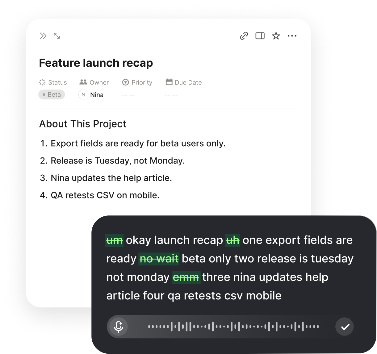
Use the spoken loop for the fixes the walk produces. Put the insertion point in the component file or the prompt field, hold the Voiskey shortcut, and say the change as one sentence with one expected result. Voiskey removes filler words and false starts and adapts punctuation to the field you are in, so a focus rule or a message change arrives as a sentence you can review and keep. Then repeat the keyboard walk on the changed state. The loop is short by design, because accessibility work is a series of small, testable corrections rather than one large rewrite.
Keep a State Checklist in the Repository
Keep the state inventory in the repository as a checklist beside the component. Each row names a state, its trigger, the element it applies to, and the check that proves it works. When a new state is added, it gets a row before it gets a style. When a state is removed, the row is deleted in the same change. This file is more useful than a design document because it lives where the code is reviewed. A reviewer can ask why a row is missing, which is a specific question, instead of asking whether the screen feels complete, which is not.
Review the checklist at the end of each change rather than at the end of the project. Read the rows for the component you touched and run the checks that apply. If a state was added without a check, either add the check or remove the state. If a check is impossible to run, the state is probably too hard to reach and should be simplified. A short review at the right moment catches the missing disabled state before it ships. A long review at the end catches it after the screenshots have already been shared with people who expect them to be accurate.
When you want the same workflow on your own machine, download Voiskey for Mac and Windows and keep the shortcut ready while the component file is open. Voiskey turns a spoken description into text at the insertion point, including file names and paths when you name them, which suits state work where each request points at one component. It removes filler and self-corrections and adapts formatting to the field, so the sentence about a focus return or an empty message arrives in a form you can keep in the checklist. That keeps the checklist and the code describing the same behavior.
Close by making the checklist part of the definition of done. A component is finished when its states are listed, its empty and error copy is written, its keyboard path is checked, and its transitions keep the layout stable. Say that sentence in the review and use it as the gate. The point is not process for its own sake; it is that interfaces fail in their states far more often than in their default view. A team that names states before styling them spends less time explaining why the screen breaks when the list is empty and more time improving the default view.
FAQ s
Voiskey is a voice typing app that works at the system level. You press a shortcut, speak the state description, and the text appears at the insertion point in your component file. It removes filler words and false starts, so a trigger and a visual outcome can be reviewed as one clean sentence.
Voiskey adapts tone and phrasing to what you are trying to do, and it learns spelling preferences. If you state the wording rule once, later dictation stays closer to it. Reviewing the spoken result beside the component keeps the empty and error messages in the same voice.
Speak the trigger, the placeholder, and what must stay fixed, all in one sentence. Voiskey clears self-corrections, so saying the revised label after an early attempt lands as the revised version. Keep the insertion point in the component so the sentence lands beside the code.
Yes. Voiskey types wherever the insertion point sits, including a component file or a prompt field, after you press the shortcut and speak. It also supports many languages and translation, which helps when a team writes state copy in more than one language.


 Voiskey
Your voice, amplified.
Download Voiskey for Mac and Windows and describe the next UI state in your editor.
Use it across macOS, Windows, iOS, and Android