
Describing a Design Mockup in Words
Turn a static mockup into a clear spoken brief that a builder can follow without guessing
 Voiskey Team
Read the Mockup in Layers
Describing a Design Mockup out loud is a skill you can practice, and it starts with layers. Open the image and resist the urge to narrate every pixel in one breath. Instead, name the page, then the regions, then the elements inside each region. Say the header, the main column, the sidebar, and the footer before you mention colors or rounded corners. This coarse-to-fine order gives whoever builds the screen a map before a decoration list. When you speak in layers, the listener can form the structure early and slot details into the right place instead of guessing where a stray sentence belongs.
Before the first sentence, write a short inventory of what the screen contains. Count the regions, the repeated cards, the forms, and the navigation links. Each item on the inventory becomes a heading in your spoken description, which makes the brief easy to check later. If a region has no clear purpose, mark it as a question rather than inventing a label. Ask the designer what the screen is supposed to help a user finish, and keep that answer at the top. A mockup described without its purpose turns into a list of boxes that a builder cannot prioritize. Ask the designer to confirm it.
Speak the reading order the eye will follow, not the order in which the file was assembled. Most screens read from the top left across, then down the main column. Say that path explicitly so the builder knows which element deserves the first focus. If the mockup breaks the convention, for example a primary action placed at the bottom right, call out that exception in a separate sentence. Exceptions are where builders guess and where bugs begin. Naming them once while you describe the layout saves several rounds of review after the first build. Write the answer at the top of the brief.
Close the layer pass with a checklist the builder can repeat. Have you named every region, stated its purpose, and described its contents from coarse to fine. Does the spoken order match what a user will see first. Did you mark unclear areas as questions instead of filling gaps with assumptions. Read the checklist aloud and confirm each item against the mockup. When an item fails, fix the description before adding visual detail. A clean structural pass is worth more than a beautiful sentence about shadows, because structure determines whether the screen works at all. Rehearse it once before you build.
Speak Layout and Spacing First
Once the regions are named, describe how they sit relative to one another. Use plain spatial terms: above, below, beside, centered, full width, fixed at the bottom. Avoid vague words such as nice or balanced, which tell a builder nothing they can act on. Say the relationship instead, such as the search field sits above the results list and stretches to the container edge. When spacing matters, give a comparison rather than an exact number you cannot see, such as twice the gap between the cards. Comparisons survive a change of screen size better than a single guessed value. Say the rule once, then apply it everywhere.
Describe alignment as a rule the layout should follow, not a one-off adjustment. Say every card aligns to the left edge of the column, or the button group stays centered under the form. Rules let the builder apply the same logic to elements the mockup does not show, such as a longer label or an empty state. When the mockup shows a deliberate misalignment, say so and explain the effect it creates. If you cannot explain the effect, treat the misalignment as a question for the designer instead of a rule. This separates intent from accident before the screen is coded.
Speak the responsive behavior in the same pass, because a layout described only at one width will break at another. Say what should stack, what should hide, and what should stay fixed when the window narrows. For example, the sidebar moves below the main column and the two buttons share one row. Use the breakpoints your project already follows rather than inventing new ones. If the mockup shows only one width, list the questions the builder must resolve and assign them to the designer. A short list of open responsive questions is better than an unwritten assumption that everyone shares silently.
End the layout pass by summarizing the rules in three or four lines. This summary becomes the prompt you speak when you ask for the first build, and it becomes the checklist for the review. Read it back and ask whether a builder who never saw the image could produce a reasonable first version. If the answer is no, the summary is missing a relationship or a constraint. Keep the summary in the same document as the regional inventory so the two can be compared. A compact layout brief is easier to test and easier to revise than a long narrative nobody rereads.
Name Components and States
Components are the nouns of your description, so give each one a stable name. Say navigation bar, search field, result card, primary button, and use the same name every time you mention them. Consistency matters more than elegance, because a builder maps each name to a piece of code. When a component repeats, say how many times and what varies between instances. For example, five result cards with a title, a short summary, and one action each. Naming the repeated parts up front prevents the builder from treating each card as a unique puzzle. Repeat the name when you introduce each instance.
Describe every state a component can show, not only the happy one. Say the empty state, the loading state, the error state, the disabled state, and the focused state in plain sentences. If the mockup shows only the filled version, mark the other states as open questions and list what information each should show. A search field with no results needs different text than a search field that failed. Speaking these states early keeps the first build honest, because the builder will not silently invent behavior that the designer never approved. List them in the brief so the builder can see the gaps.
Use the project's own vocabulary for actions and labels. If the product calls it a workspace rather than a folder, say workspace. Listen for the moment you reach for a synonym because you forgot the exact term, and correct it in the next sentence. Write the label text exactly as it appears in the mockup, including capitalization, so the builder does not rewrite it from memory. For placeholder text, say whether it is real copy or a stand-in that will change. Clear nouns and exact labels remove the most common source of small mismatches between design and build. Say the label aloud once to hear it as the user will.
Finish the component pass with a state table spoken as short lines. Name the component, list its states, and say which ones the mockup covers and which remain unknown. This table becomes the acceptance list for the build and the review. When the builder asks a question, point to the row instead of rewriting the whole brief. Update the table when the designer answers a question, and say the change aloud so it is captured in the next prompt. A visible state table turns hidden assumptions into decisions that the whole team can see and dispute. Keep the table beside the brief in the same document.
Review and Refine the Spoken Spec
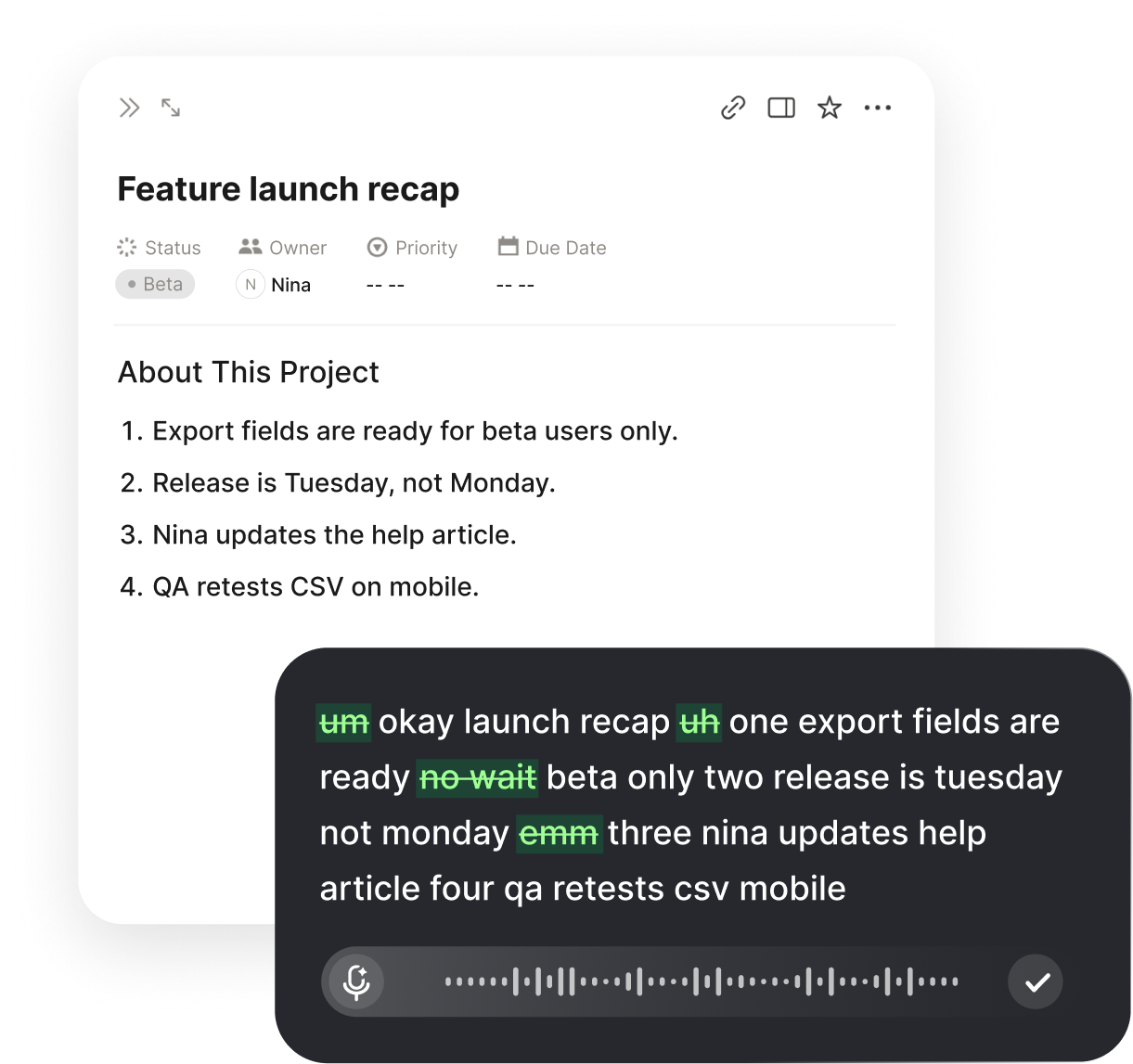
When the spoken description is complete, use Voiskey to read it back at the insertion point in the document you are already editing. Fix the sentence that sounds vague instead of rewriting the whole brief. Because the app removes filler and false starts, the polished text keeps the structure you spoke without the verbal noise. Ask a developer who did not see the mockup to read the brief and sketch the layout on paper. Compare the sketch with the image, then dictate the corrections into the same section. When the brief is approved, download the final document and attach it to the build task.
Run the review as a set of pointed questions rather than an open discussion. Can the builder name every region without the image. Does each state have a described appearance. Are the spacing rules stated as comparisons or rules. Is every label exact. Note the answers beside each question and fix the brief where the answer is no. Use Voiskey to dictate the fixes in place, because speaking is faster than retyping and keeps your attention on the mockup. Then download a fresh copy and ask the reviewer to confirm the changes match their notes. Fix the first failing answer before moving on.
Keep the brief and the mockup side by side while you polish. Speak each correction while pointing at the element it concerns, so the sentence names the right component. If two reviewers disagree about a detail, mark it as open and assign the question to the designer instead of choosing silently. Record the decision and the date in the brief. When the build begins, the open list tells the developer where to expect change. Download the approved brief for the task and keep the mockup link beside it, so nobody has to hunt for the source later. Update the open list whenever a question is settled.
Set a short definition of done for the description itself. The brief is done when a builder can produce a first version without asking about structure, spacing, or states, and when every remaining question has an owner. Read that definition aloud before the review and check it item by item. If the build starts before the definition is met, the missing detail will reappear as review comments or rework. After the review, download the signed brief and store it with the task. A clear definition of done for the words saves far more time than polishing the design language. That standard is the one the review must meet.
Reuse the Description Across Builds
Keep the approved brief as a reusable pattern for the next screen. When a new mockup arrives, open the previous brief, read its structure aloud, and replace the parts that differ. Because Voiskey learns the component names and labels your project repeats, the second pass is faster and more consistent than the first. Speak the deltas instead of the whole description: same header, new result card with an extra action, no sidebar. At the end, download the new brief and attach it to the new task, keeping the original as a reference. Reuse turns a one-off description into a team habit.
Build a small library of description templates for the screens your team makes often. A list page, a detail page, a form, and a settings page each have a predictable shape. Speak the template once, save the polished version, and start new briefs from it. When a template stops matching the design system, revise it in one place and note the date. Share the library with designers and developers so everyone describes screens the same way. A shared template reduces the translation work between design and code, and it makes reviews faster because the structure is already familiar. Note what changed between the two versions.
After each build, compare the shipped screen with the brief and note where the description was incomplete. These gaps are the most valuable input for the next template. Speak the missed detail into a short lessons list, and if a pattern repeats, add it to the template itself. Use Voiskey to dictate the lessons at the insertion point in the shared document, then download the updated template for the team. Keep the list short and specific, such as always state the empty state for a list. Specific lessons change behavior; general advice does not. Name an owner for the library.
Review the library on a schedule and remove anything the team no longer uses. A stale template teaches the wrong structure and costs more than starting fresh. Ask one designer and one developer to walk through a template aloud and mark any sentence they would change. Update the template, download the revised copy, and announce the change where the team already reads project notes. When a new screen fits no template, write the brief from scratch and decide afterward whether it deserves a new pattern. This keeps the library small, current, and genuinely useful. Keep the review short and scheduled.
FAQ s
Speak the page, regions, and elements in that order at the insertion point in your brief, and Voiskey removes filler and false starts while keeping your structure. You can then read the polished text against the image and correct one sentence at a time. The result is a short brief a builder can follow without seeing the mockup.
Name the page and its regions before any visual detail. Say the header, main column, sidebar, and footer, then move to components and states. This coarse-to-fine order lets a listener form the structure early, so later details land in the right place. Keep the same names throughout the brief so the builder can map each one to code.
Yes. The app learns the names and spelling preferences you repeat, so the same component label appears across passes. Say the exact label once, check the inserted line, and keep using the project term instead of a synonym. A consistent brief reduces small mismatches when the screen is built.
Download the finished brief and attach it to the build task beside the mockup link. Note the date, the reviewer, and any open questions with an owner. Ask the developer to read the brief before starting and to raise gaps early. A downloaded copy gives the team one approved version to work from.


 Voiskey
Your voice, amplified.
Download Voiskey for Mac and Windows to describe every screen in clear, build-ready language.
Use it across macOS, Windows, iOS, and Android